Category: Assignment #4

  • Question 3

    Visit the St. Clair College website. Analyze it strictly from a visual marketing strategy perspective targeting Local domestic high school students.

    You are to provide three strategic visual enhancement recommendations. For each recommendation: 

    a) Clearly identify the issue or missed opportunity (3 x 2 = 6 Marks)

    b) Propose a specific visual improvement (3 x 2 = 6 Marks)

    c) Explain why it would improve recruitment effectiveness (3 x 2 = 6 Marks)

    d) Connect it to student psychology and digital behaviour (3 x 2 = 6 Marks)

    Missed Opportunity 1

    Implement An Academic Reputation Section

    High school students are unique individuals but many of them face the same barriers when it comes to choosing a college. A common one is trusting the academic reputation of a school, imagine you didn’t know if the school you were going to yielded real results? Colleges like Fanshawe address this incredibly well by implementing a section on their landing page that discusses graduate satisfaction rate, employment rate, employer satisfaction rate and alumni testimonials. St Clair does not offer anything on the landing page that builds trust like this, we have to remember that at this stage in the consumer journey they are somewhere at the middle of the funnel and they are either interested in going to college or they are ready to make the decision on what college to go to. Without trust building information that solidifies St Clair’s reputation and ability to produce satisfied and employed graduates then the competitors have an advantage. Highschoolers have time to look for the right college and if they can find one that immediately presents them with cold hard facts about success they are more likely to choose them over one that doesn’t highlight these statistics. 

    Incorporating this visually would be as simple as adding a section in the hero or upper half of the page with bold text that shows the relevant statistics of success for graduates after college. By doing this, highschoolers will immediately be exposed to real results without having to dig through a pile of links. Another way to address this concern would be to implement a scrolling testimonials section with the alumni names and current positions in their field. It would be a small addition that makes a big difference and provides real trust building content.

    This improves recruitment effectiveness because as I said before these highschoolers are sitting at the middle of the funnel, they are interested and some want to make a decision. By addressing a primary concern of the schools ability to produce real graduates and give real results. If a highschooler can see cold hard facts that the courses work and nearly guarantee results that is one less barrier to get through the funnel. College is expensive and students put a lot on the line when they decide on a college. Highschoolers care about their future, they want to succeed and trade their academic life for a fulfilling career. By immediately highlighting that what we do works and that they are almost guaranteed a career then it only logically follows they will be more likely to apply.

    Missed Opportunity 2 

    In Demand Courses Section

    St Clair’s site does not address one of the biggest concerns of highschoolers “Will I get a job?” and “What courses will get me a job?” By implementing an In Demand Courses section that highlights the top courses where there are more jobs than students to fill those positions. We are talking to highschoolers who are ready to make a decision and instead of making them dig through courses and hoping they don’t land on a bird course St Clair should give them a list of the courses that employers are looking for. By addressing the need for a real career and almost eliminating the search process you create an easy to navigate funnel-pushing system that doesn’t deter highschoolers from the site and bouncing to the next one. 

    Visually this can be implemented in a carousel format with the name of the course, a brief description, graduate satisfaction rate and an alumni testimonial. Incorporating a photo of a person working in that specific field to detail what the job looks like can help highschoolers visualize themselves in that specific career. Adding a button that will send you to the course page to learn more as a CTA will help simplify the user experience as they will not have to search through the site to find the course. 

    By implementing this St Clair decreases the time it takes for highschoolers to find a course and keeps their attention. If highschoolers are looking for real results and a career out of college then why is St Clair not immediately giving this to them on the home page? It addresses the need for assurance that they are going to gain something out of going to St Clair. This is a major part of the decision making process for any highschooler and is a major barrier. St Clair can remove this barrier by providing this information immediately and by removing the barrier highschoolers are more likely to take action and apply. 

    Missed Opportunity 3

    Linear Home Page Design

    The biggest problem overall is the homepages design. I will use Fanshawe as a comparison because of their successful implementation of this method. The Fanshawe homepage follows a linear format that addresses primary high school student concerns without overloading the user with information in an organized and easily digestible way. When scrolling the Fanshawe page they address concerns one by one, starting with what programs are offered and the ability to find  a program that aligns with you, a costing section which addresses the highschoolers need to know how much they are financially investing, a careers section that lets you explore careers with a career coach which addresses the need for career assurance, a graduation statistics and testimonials section which builds trust and authority for the college, a campus life section that highlights the labs, study environments and campus life. At the bottom of the page they have a tour of the campus section. This is all done in a linear format that addresses highschoolers concerns in each section, nothing is hidden and it is laid out in such a way that if a highschooler faces a decision making barrier it is easily lifted. In comparison St Clair has designed the home page with tons of information and very few is relevant to the target demographic. In the hero section they choose to prioritize links over displaying relevant information. It’s full of links to pages that contain information but why would a highschooler take the time to look for information about success rates and career opportunities when they can find it quicker on Fanshawe’s site. 

    Visually implementing this would mean removing content that doesn’t prioritize the target demographic. Highschoolers want to know what a school offers that’s relevant to them, this means jobs, costing, success rates and college life. By reformatting the homepage to address these four primary concerns the highschooler doesn’t have to feel overloaded with unnecessary information and makes it easier for them to be pushed through the decision making process. In the hero section you highlight the type of programs (full time, part time etc.) and add an in demand courses section that leads to jobs. From there you incorporate a statistics and testimonials section, this creates trust and builds confidence in the school. Add a costing section that links to course costs and highlights the average tuition fee along with a link to OSAP and this will address the concern of price. Finally talk about campus life and offer a virtual tour of the school. By following this linear format instead of cramming a bunch of links into the site you create a more fluid user experience that is designed for the target demographic.

    This is the biggest implementation that can improve conversion rates. A user’s time is precious, if they can not find what they are looking for in just a few seconds they are way more likely to find a new site. By removing fluff and highlighting necessary information in a linear format the home page becomes clear and concise. Why are we making the user work for information? They do not earn anything from it and they are the ones who are facing a high risk high reward problem. By immediately addressing in a concise manner the concerns and questions of your target audience you lift barriers of entry and push through the funnel leading to higher conversions. A linear format is the definition of less is more because the less work a highschooler has to do the more likely they will apply for a course.
  • Question 2

    6 Nutritional Tips For After 40

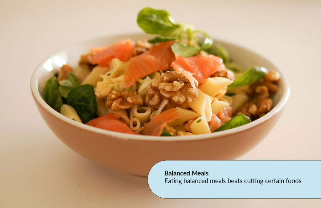
    Balanced Meals

    A balanced and healthy meal in a brown bowl with text. Describing the benefits of eating balanced meals.

    Having balanced meals is better than cutting out certain foods. Making sure you have nutrients like protein, carbs and fats in all your meals means you will have a healthier diet in the long run.

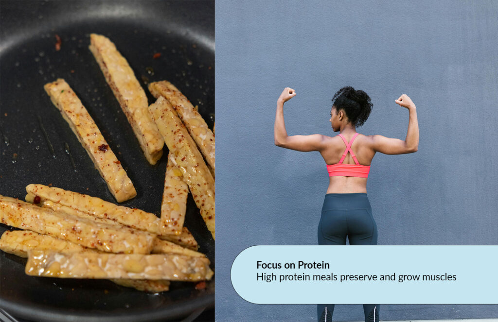
    Focus on Protein

    A protein-filled meal next to muscular women posing.  Describes the benefits of eating protein.

    Meals should be high in protein to preserve and grow muscles. Protein has been tested to be the most effective for muscle growth and preservation. This is important as muscle decreases with age.

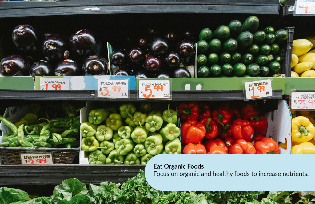
    Eat Organic Foods

    A collection of vegetables and organic foods for sale. Describes the benefits of eating organic foods.

    Focus on organic and healthy foods to increase nutrients. Eating organic whole foods is a great way to avoid refined sugars and unnatural products in your diet. Helping you live longer and happier.

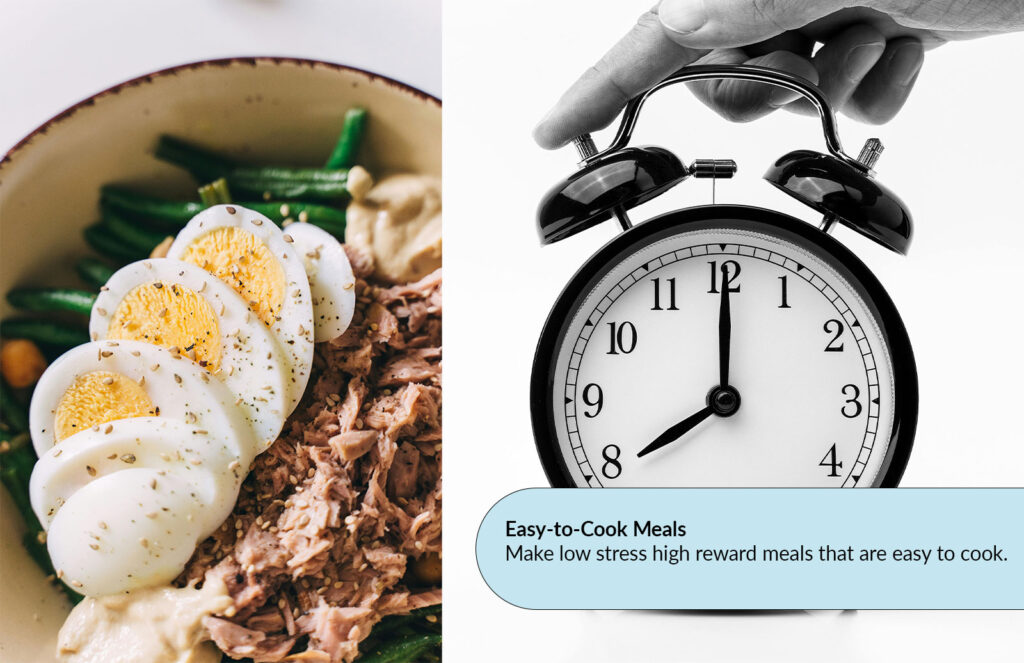
    Easy-to-Cook Meals

    Easy to cook meals next to a clock to describe the benefits of making easy meals.

    Make low-stress, high-reward meals that are easy to cook. Nutrition is made easy when you make meals that aren’t complicated. It saves you time and helps keep you in a routine while being affordable.

    Prep Your Meals

    Prepare your meals in advance to save time. Meal prep allows you to store your daily meals so you don’t have to worry about the cooking hassle. It’s stress-free and a great way to stay organized.

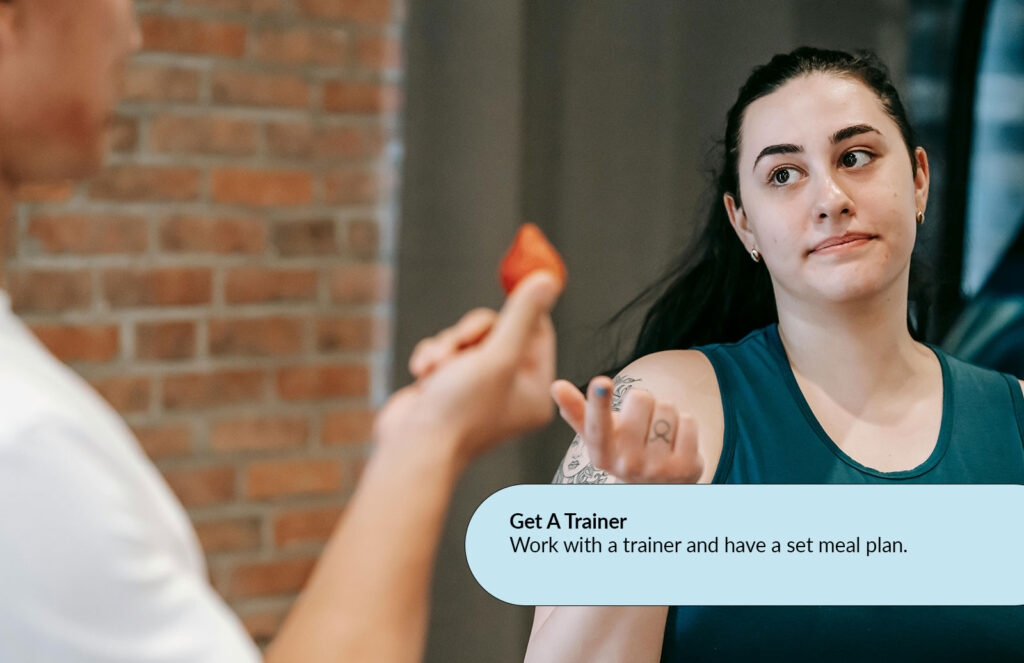
    Get a Trainer

    Work with a trainer and have a set meal plan. This way, you can be kept accountable and on track. When you work with a registered Friendly Muscles trainer, we give you a full nutritional plan catered to your needs.

    Check out friendlymuscles.com and book a free consultation today to get your own meal plan that meets your nutritional needs.


    Pages: 1 2

  • Question 1

    1. Question 1 

    Visuals are not decoration. They are communication tools. Provide three strategic reasons why visuals are essential to effective web content. For each reason: 

    • Clearly explain the concept 

    • Provide a real-world example (not generic statements) 

    Marks are awarded for depth, not surface-level answers. (6 Marks)

    Strategic Reason 1

    Visuals Leave a Lasting Impact

    With visuals you are able to leave a lasting impact on your audience as retention is increased compared to written information “People remember only 10% of information heard three days later, but retain 65% when paired with relevant images. Visual learning increases retention by 400% compared to text alone” (Briscoe, The Power of Visuals in Web Content Overview (W26).pdf, Slide 4) This shows that our minds desire visual stimuli and thus we can more easily recall information spread through images rather than something explained with words. “67% of consumers say product images are very important in purchase decisions, 84% of people have been convinced to buy after watching a brand’s video” (Briscoe, The Power of Visuals in Web Content Overview (W26).pdf, Slide 5) Visuals create trust when it comes to brand communication, it allows us to connect with a brand on a deeper level and drives us to want to purchase an item. If McDonalds had an advertisement out for its new burger but instead of their advertisements featuring a tasty burger they simply put text describing the burger. We may be able to imagine the burger based on words like brown juicy paddy or melted cheese but people will be less likely to remember the description. We are visual creatures “90% of information transmitted to the brain is visual” (Briscoe, The Power of Visuals in Web Content Overview (W26).pdf, Slide 1) So it is no wonder we gravitate towards visuals and why they leave an impact on us. 

    Visuals have played a role in advertising even before the internet and when advertisers were competing for people’s attention on traditional media. The major difference between now and then is that the audience isn’t captive, they have more of a choice to scroll away from your ad and find something more entertaining. This is why impactful visuals matter “People form first impressions of websites in just 50 milliseconds” (Briscoe, The Power of Visuals in Web Content Overview (W26).pdf, Slide 1) This applies to all visuals and shows that the impact is almost immediate but this also means consumers are quick to judge a book by its cover. If the image catches our attention but it isn’t impactful it can be just as easy to forget as it was to process it.

    Again it must be emphasized that the viewer only has so much time they can spare “The average attention span is 2.8 – 8 seconds” (Briscoe, The Power of Visuals.pdf, Slide 13) and its important to recognize the viewers time is sacred and if the visual is uninteresting or not impactful then they will likely not care to read or listen past the initial two seconds. Images are more than just a visual checkmark that accommodates your written work, if your visual doesn’t stick out then why should anybody read it? If you’re scrolling on TikTok or YouTube reels and an ad pops up but the first two seconds are just silence with no visual stimuli what’s the point of your staying on that video. If you are writing a blog post about a niche topic and instead of incorporating visuals, you simply have a wall of text in a basic font. People will take one look at that and not bother reading it because there’s too many words. People aren’t stupid they’re stingy and their time matters to them.

    While visuals do leave a lasting impact this must be considered strategically. Visuals must feel relevant and appealing to be impactful. Without impactful visuals viewers are more likely to ignore or forget what is being offered to them.

    Strategic Reason 2:

    It Leads To Conversions

    When discussing the strategic impact of visuals online it should be emphasized that incorporating visuals leads to a higher conversion rate “88% of people say they’ve been convinced to buy a product or service by watching a brand’s video.. Landing pages with videos can increase conversions by up to 86%. Quality product photography directly correlates with purchase confidence” (Briscoe, The Power of Visuals in Web Content Overview (W26).pdf, Slide 5) Visuals like video demonstrations, product photography and other visuals create trust and reduce anxiety for the consumer. People want to purchase something that feels tangible and something they can visualize themselves using in their lives. The best comparison would be innovations in this area that uses your camera to generate a photo of how you may look wearing a product. Hair stylists have even incorporated using AI to let someone see what a hairstyle may look like on them. While these examples may seem above and beyond in some cases it still clearly emphasizes a consumer’s need for visual reassurance, it’s harder to trust someone who describes the mansion they own but never shows it versus someone who actually shows you the mansion in person.

    Beyond images and video interactive content is another powerful tool in this regard, “Interactive Content generates 2x more conversions than passive content and increases time on page by 47%” (Briscoe, The Power of Visuals in Web Content Overview (W26).pdf, Slide 6) Consumers crave interaction, it feels unique and allows the user to immerse themselves in the content. By feeling as if they were part of the content they feel they have a stake in the information they are learning. Interactive content has been shown to work with cases such as Shopify Merchants who offered “360 degree product views that increase conversion rates by 27% and reduce returns by 22%” (Briscoe, The Power of Visuals in Web Content Overview (W26).pdf, Slide 9) by letting the user experience the product as if it was right in front of them, the user gains trust in the product.

    When incorporating visuals the easier the consumer can visualize the product in their daily life the better. This variable can depend on the perceived cost, you likely wouldn’t need a 360 degree view for a burger from McDonalds but if you’re buying a car that’s a large investment and requires more reassurance. Visuals provide reassurance to consumers and reassurance creates conversions.

    Strategic Reason 3

    Visual Makes Up The Modern World 

    Everybody is a photographer, designer, cinematographer or essentially anything that used to cost thousands of dollars to produce in the past visually. Just take a look at the apps we use like TikTok, YouTube Reels, Instagram Reels and other short form video content apps. “Instagram has 2.5 billion active monthly users” (Briscoe, W9 – D – Enhancing Content (W26).pdf, Slide 19) “10% of all pictures taken by all humankind were shot in the last 12 months” (Briscoe, W9 – D – Enhancing Content (W26).pdf, Slide 15) These stats highlight a powerful truth, visual is the dominant medium in the modern day and if you still prioritize written content alone you are being left in the mud. With everyone else being able to share visually it means that visuals are a necessity in web advertising and it helps create a clear picture of the extreme amounts of information people are processing on a daily basis.

    “Tweets with images receive 150% more retweets than text-only-tweets” (Briscoe, The Power of Visuals in Web Content Overview (W26).pdf, Slide 9) The thing with twitter is that when somebody uses the app they are effectively ‘doomscrolling’ they are quickly running through content, processing everything in milliseconds and will only stop if they are captivated by a post. The best way to get someone to stop scrolling is to incorporate a visual element that engages the user and captures their attention. This is not news, you are competing with everyone who has posted a photo on their feed so why put yourself at a disadvantage by not adding a visual element to your post. 

    This rule should go for any bit of content that you make. If you know you’re competing with 2.6 billion other people and brands then you should be doing anything to get an edge against your competition. By incorporating visual elements you immediately eliminate competitors who did not utilize them.